OS UI Breakdown: What Works, What Doesn't
and what needs to change for future iterations.
Jack Percy
Introduction
Problem Statement
Research and design a new style of Start Screen, Start Menu or integrated Home Screen/File Explorer for the OS which supports a frustration-free experience.
Purpose of the Report
This reports purpose is to dive into issues that we found as a group from testing different user interfaces individually through a user journey map and from feedback from different students we consulted, to come to a conclusion of universal problems across multiple operating systems and to provide different solutions based on our findings and how the research could be deepened to provide better support for changes in future iterations of operating systems user interfaces.
Methodology
Our first method of research was interviewing a small group of individual students, asking open-ended questions about, their favourite and least favourite operating systems and why and what they would like to see in future iterations of the user interfaces of the operating systems they use, keeping the discussion open ended allowed us to collect more anecdotal data and get a real understanding behind the issues they face rather than a ‘black-and-white’ thinking. From the data we were able to test our findings to validate our findings from researching through a user journey map, mapping out different operating systems when completing daily tasks and using common features that would be used daily within the different operating systems such as file navigation, quick settings and integrated search we tested these tasks with high-end consumer hardware on the latest editions of all the operating systems we used. Doing this allows us to uncover usability friction points in these areas. We chose to test Windows 11 as it is Microsoft’s latest operating system, and as Windows in general holds the market share for the most used operating system, with a market share of 70.14% (Statcounter, 2025). macOS Sequoia, as it is Apple's flagship operating system compatible with Macintosh systems from 2019 onwards, and Linux Mint, as it is a popular distro and is widely used at UC in the computer science and software engineering department. During the testing, we took notes and screenshots of the different steps to achieve certain tasks and compared what different operating systems either had the same style of features or were different. Looking out for friction points, usage of tangible user interface design for a streamlined experience and the methods of competing basic tasks.
User Journey Mapping Examples
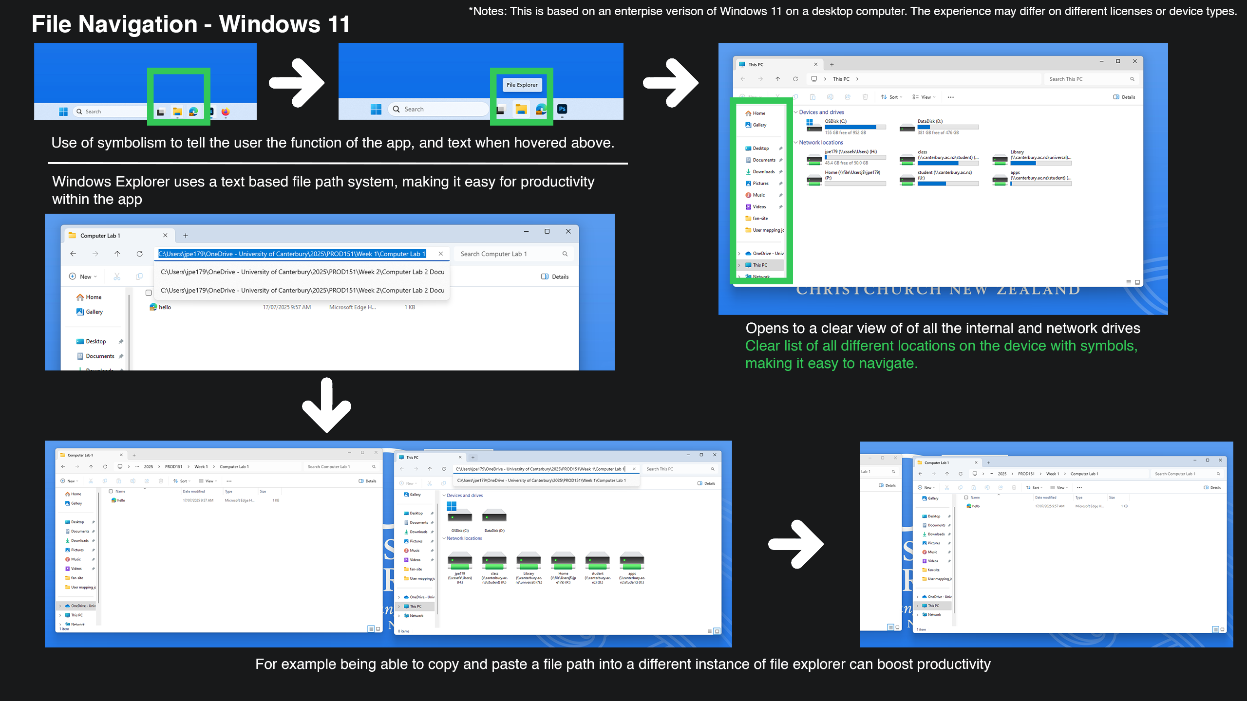
Windows File Explorer User Journey Map
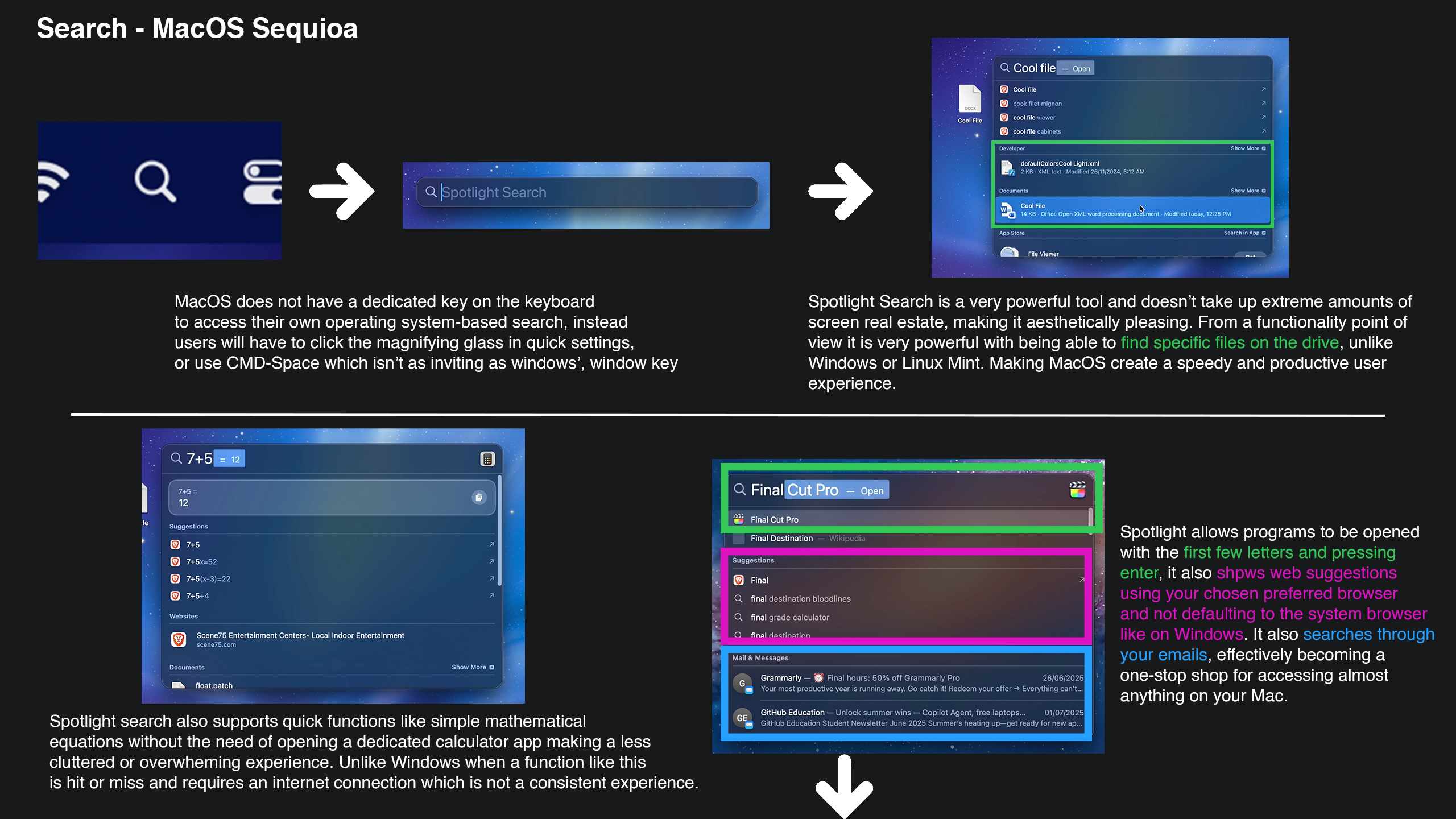
macOS Spotlight User Journey Map
Findings
Familiarity & Habit Drive Preferences
Across nearly all interviews, participants cited familiarity as the main reason for preferring a particular OS.
“Windows because it is the most intuitive to me and I have used it for the longest time.” – Tristan, Engineering Student
“[macOS] Mostly out of habit, less nonsense compared to Windows, and it’s intuitive.” – Mark Rickerby, Lecturer
“Used it forever and can be used to game on.” – Oscar, Computer Science Student
Just from these insights, it clearly shows how learned behaviour, and long-term exposure can strongly influence preference for a particular operating system. People stick with what they know, even if different platforms offer better technical and user experience benefits.
The Overwhelming Dislike of macOS
Throughout our outreach to students, macOS consistently came up as the least favourite OS, due to its design, pricing and software compatibility.
“Unintuitive mouse control, too round and bubbly UI. Feels like it’s built like it’s kid-proof.” – Ollie, Humanities Student
“Disliked Apple majorly for its consumerism… selling products without much care for their user at marked-up prices specifically for their branding.” – Connor, Digital Screen
“The traffic light system isn’t clear as it doesn’t fully close the program… Finder doesn’t use file paths like Windows, making it harder to use in a productivity sense.” – Miya, Digital Screen
“Less convenient functions, less available, some software cannot be run.” – Claris, Senior Lecturer
Though macOS may appeal to casual users, the users we interviewed flagged a lack of transparency (hidden features like no file paths) and a dislike to its overall interface. However, outside of our data that we have collected I have seen many people praise macOS for its aesthetic design and how easy it is to use but this potentially could play into the aesthetic-usability effect where people perceive more aesthetic designs as more intuitive compared interfaces that are not as aesthetically pleasing. (Wikipedia, n.d.) But a lot of our data we collected was from hard-core Windows or Linux users, which could be a reason we didn’t see this response.
Windows Criticism: Ads, bloat, updates
Not all operating systems we studied are immune to criticism, even Windows, with the largest user base of any operating system on the market today, still shows criticism, which uncovers the flaws within the platform.
One Creative Arts student, Jaron, commented on the “Bundled applications on Windows 11”, such as OneDrive, Office, and with preset methods of operation, such as being forced to see stock market stats or the news (which is present on consumer licenses of Windows 11). Jaron would rather be sent straight to the desired task rather than be muddled with distractions.
I spoke to a Computer Science student, Thomas, for about an hour, discussing the many issues he had with Windows and Microsoft, how Microsoft’s monopoly of being the standard operating system allows it to incorporate advertising in an intrusive way on consumer hardware, leading to a bad experience when dealing with its user interface.
Ben, a Fourth-Year Software Engineering Student, commented on its lack of true customisation, with it being general customer-focused, instead of being pro and customisation-focused. He emphasised how they need better customisation features.
With Windows being so popular, it strikes a balance between familiarity and functionality, but contains extreme backlash for bloatware, ads impacting the user interface, ease of use, all of which impact the overall user experience on the platform due to it’s interface design.
Linux: Loved for customisation and control, hated for compatibility
The few users we interviewed who regularly use Linux praised its lightweight nature and customisation on the distros that they use
Ben also commented on its lightweight interface, making it his most personally used operating system. He commented on his ability to customise almost anything, including the interface, allowing him to transform the operating system to suit his exact workflow.
Though it was commented on for being people's least favourite, Mark Rickerby commented on how poor the font rendering is (in line with its interface design), and the various driver and software compatibility issues.
Linux can be seen as a power user’s tool, but it can have a technical learning curve, making it unsuitable for casual users, depending on your knowledge of basic operating system user interfaces, depending on the distro of Linux you are running, such as Ubuntu and Linux Mint being the easiest and other distros like Kali Linux being more advanced.
Other findings
We also found that operating system usage is contextual with different use cases suiting the different needs of the users, for example, a lot of video games only support Windows and leave out Mac and Linux, or certain pro apps like Final Cut Pro or Logic Pro X are exclusively available on macOS and apps like Vegas Pro are Windows exclusive. Meaning the users we consulted who use multiple operating systems juggle between the ones needed for productivity and leisure.
Overall, the research highlighted how operating systems are deeply tied to familiarity for their usage, but it also exposes recurring friction points, with different operating systems such as simple mathematical equations requiring internet access to achieve through the search function on Windows whilst it can be done on macOS easily, this type of dependency can frustrate users with interruption to their workflows, reinforcing broader concerns we found with intrusive updates, bloatware and a design that isn’t offline-first.
Comparsion Table
| OS | File Navigation | Search | Quick Settings | Friction Points |
|---|---|---|---|---|
| Windows 11 | Clear file paths, classic explorer | Functional but limited search bar | Quick settings accessible | Menus can feel cluttered |
| Linux Mint | Simple, lightweight file manager | Limited by indexing | Functional but plain | Hard to trace folder hierarchy |
| macOS Sequoia | No visible file paths by default | Spotlight fast and powerful | Intuitive Control Center | Hard to trace folder hierarchy |
Analysis & Discussion
Desire for Stability and Familiarity
From our research on consulting students, we can see that people wanted less friction and more control over their workflow or how they are used to their method of working anyway, which can be seen with this quote: “Stop changing, some things don’t need to be changed” – Ollie, Humanities. Meaning fewer constant updates, drastic changes that haven’t been properly tested are not viable when maintaining a user interface; they should improve, not disrupt, as we uncovered issues with users disliking forced UI changes such as Windows 11 right click, which contains a more simplified design at the loss of features for pro users.
Friction from Bundled Software and Ads
They also showcase that bundled apps and ads disrupt flow and adds visual noise to the interface, for example several people commented on how Windows 10/11 Home edition is filled with bloat with preinstalled apps and advertising leading to a general annoyance, and a disservice for all Windows users that would have had to pay for a license either directly or indirectly (through their device purchase). This can be a major visual distraction for users, impacting power users’ workflows.
Strengths and Weaknesses Across OSes
Other strengths I found within the different operating systems that some lack on, was Windows and macOS file transfer systems. Where macOS only shows a progress bar without any real data to work from besides an estimated time remaining, whereas Windows shows you a graphical view of the speed of the transfer, and the file that is currently transferring when you are transferring multiple. This UI choice that Windows uses may not be the most aesthetically pleasing, but it showcases real data that users need to know. But with that plus for Windows, it has a downfall for its search bar function, with it requiring an internet connection to do basic mathematics, and you’re forced to use Bing and Microsoft Edge while using it to search, whilst macOS does not and allows you to use a custom browser within its own search function. Though Windows lacked in this department compared to macOS, Linux Mint contained nothing extra like Mathematics or web searching at all, which, for some users this can seem like a no-frills search function perfect for themselves, and others might think it's lacking in consumer interface functionality, which plays into the notion that no change fits all.
Limitations and Bias within the Research
The feedback and data we received needs to be taken with a grain of salt; we interviewed only 16 people total, all from the University of Canterbury, meaning the sample size pool of the data is minimal, but allowed us to get a more personal result for our findings rather than mass sending a digital form. We also need to factor in that some people are die-hard fans of their preferred platform. For example, when interviewing Thomas (CompSci Student) and Ben (SENG Student) I noticed that their love for Linux was extreme and so was their hatred toward Windows which also plays into this notion, and other examples such as Miya (DigiScreen) disliked macOS heavily and Windows was her favourite; however Miya stated having minimal experience using macOS and grew up using Windows yet had strong opinions directed towards macOS’ interface. Tests in the user journey mapping shows a best-case scenario, such as using modern technology with computer specs the average user would not have, including the usage of an enterprise version of Windows, which doesn’t nearly have the same amount of bloat compared to a home version, as was pointed out in our interviews. We also only tested daily everyday tasks, but a more in-depth version of our research could test workflow when using different pro apps across these devices to test the interface more in different scenarios.
Broader Implications
These insights suggest that users aren’t looking for a radical redesign, but consistency, stability, control and simplicity in their OS interface. Such as a predictable UI design and behaviours, reduced reliance on consistent connectivity, or options to disable unnecessary pre-installed software and in-device advertising. These small universal shifts that prioritise user agency could improve satisfaction across all operating systems, allowing them to not stand out individually because of basic user interface issues that they resolved, but more core features that can be appealing for different user types.
From what I have found and as mentioned before different Operating Systems serve different tasks for many users, with Windows viewed as a versatile, widely used leading to more consumer centric focus to its UI, and with macOS achieving its minimalist design language not only when it comes to their physical product design but their digital product design also, which can lead to confusion in the name of aesthetics in macOS’ UI, and finally Linux looking light-weight and basic yet extremely customizable for users that are okay with digging deep with settings and external software which can pose a barrier for those that aren’t as tech savvy.
New Recommendations
From our research through consulting other students and testing through our user journey map, I was able to come to some recommendations that can be adopted universally when it comes to OS interface design, allowing for the individual OSes to stand out on their own features rather than the operating system that has the most usable user interface.
-
Prioritise transparency and visibility
Avoid hiding important statues or features behind extra menu (e.g. file path visibility, right-click context menus). Clear and open user interfaces can empower both new and pro users by allowing for a visible system status.
-
Consistency Across Updates
Lorem ipsum dolor sit amet, consectetur adipiscing elit. Explain how keeping interface changes minimal improves familiarity and reduces frustration.
-
Integrate File Management and Home Screen Functions
Some users expressed for a smoother transition between file navigation and the desktop. Predictive features, such as showing recently accessed or relevant files (potentially based on user patterns, though this opens a privacy risk if it is computed externally), could help streamline individual workflows without overwhelming users.
-
Respecting Familiarity and Reducing Disruptive Changes
One of the biggest disruptive changes in recent years was the release of Windows 11 and the quick end-of-service for all security updates and feature updates for Windows 10 upcoming in October 2025, forcing users to either upgrade or become vulnerable. The Windows 11 redesign is frustrating users who rely on their own established workflows due to features being removed or changed drastically. Taking an Iterative, well-tested approach with user outreach is much preferable compared to forced major changes.
-
Minimise Distractions, Bloat, Bundled Applications.
An overwhelming number of people we interviewed complained about the bloat within Windows, including advertisements, stock updates, news, and intrusive large notification panels and importantly, pre-installed software that developers pay to be on by default. Users should not have to face this on a paid product, and, ironically, it isn’t present on many free Linux distros like Linux Mint. This approach to minimise all bloat is to promote productivity and not corporate greed.
-
Enhancing User Control and Customisation.
Users want deeper control to customise it to make it work for them. Such as repositioning the taskbar (without limitations like we have now across Windows and macOS), adjusting menus, and the ability to opt out of mandatory services (such as the need to have a Microsoft account to set up Windows 11). Customisation respects people's different workflows and reduces the resistance to change.
-
Improve Explainability and Onboarding
Features need to be discoverable and self-explanatory; this can be achieved through skeuomorphism. As hidden features and functions reduce usability and abstract symbolising for core interface functions, and symbolising is not user-friendly and can be overwhelming for new users (For example, Finder on macOS uses a happy face, instead of a folder/file on Windows and Linux Mint).
-
Cross-platform consistency
While each OS has its own unique identity, maintaining some consistency, such as terminology, shortcut logic, and file navigation patterns, would help the users who switch platforms for work or study or encourage users to get out of the mindset of growing up and sticking to the same operating system for their whole life.
Conclusion
Operating system interfaces are far from perfect; this study was a way to explore frustrations and strengths in different OS UIs through interviews and journey mapping. The core takeaway is not about reinventing UIs, but is about reducing user friction, giving users more control, customisation and avoiding unnecessary disruption. We also found that users want consistency and stability over flashy redesign and how disruptions like Ads, bloatware and forced features (such as mandatory services like Bing and MSN) control the end-user rather than give them freedom. We know from being human that everyone has different needs and preferences, and this applies to computing; different operating systems can achieve different things for users, meaning no single interface can be ‘perfect’. As mentioned the findings from our research are valuable but is based on a small sample size (16 people) but if this research is carried out again in the future with a budget and with the same personal discussion but more in-depth with the participants the data could draw to larger conclusions uncover more issues that we haven’t met yet through interviewing and more in-depth testing, such as testing with various software’s so see how the operating systems UI interacts with third-party software, test more niche operating systems rather than the most popular ones, and deepen the understanding with compatibility with external devices like syncing notifications to the desktop user interface seamlessly. Another way to strengthen the research is to run long-term studies to see how users adapt to updates over time, rather than just first impressions of UI changes, which can usually be negative. Improving UIs isn’t just for aesthetics and shouldn’t be treated by developers as just a way to get a fresh coat of paint, as it affects productivity, accessibility, the way the end-user thinks and feels over a particular operating system and their overall trust in the technology. The findings we have made show that small practical design changes could have enormous positive impacts. Ultimately, future OS designs should not only push for innovation but also balance it for familiarity and user choice, as bold ideas can be great, but they should not be at the cost of usability for everyday people.
References
- Statcounter. (2025, June). Desktop Operating System Market Share Worldwide. Retrieved from https://gs.statcounter.com/os-market-share/desktop/worldwide/#monthly-202506-202506-bar
- Wikipedia. (n.d.). Aesthetic-usability effect. Retrieved from https://en.wikipedia.org/wiki/Aesthetic%E2%80%93usability_effect